Color grading for photographers
How to Color Grade Your Photos on Purpose
The short answer: good color grading starts before you even touch a slider. It's deciding what you want people to feel, then using color to get them there, in four steps. First the why. Then read the colors already in your photo. Then pick a color harmony that fits. Then, and only then, edit. Do it in that order and the guessing stops. Here's exactly how, in any software.
First, what color grading really is
Color grading isn't moving sliders around until the photo looks a bit better and hoping for a miracle. It's directing color on purpose, so your photo actually says something and stands out.
But most of us skip straight to the sliders. You open the photo, you don't know where to start, so you move the sliders because you feel like you should be doing something, but really you have no idea what you're supposed to be doing. Some photos come out great by accident. Most stay flat, or a bit off, and you can't tell why. So you crank the saturation hoping something will finally make them pop, and it just looks worse.
Then you look at other photographers' work, and their colors just work: richer, more cinematic, and somehow consistent from one photo to the next. Meanwhile yours feel all over the place, or worse, they look like everyone else's. It's easy to decide they just have "the eye" and you don't. I thought that for years. They don't. They've simply learned to color grade with a purpose, and that's a method you can learn too.
The 4 steps to color grade any photo
Here's the process I run on every single photo. It's not a technique, it's a method. Four steps, same order, every time.
1. Intention: start with the why
Before you even open your editing software, ask yourself the why. Why did you take this photo? What made you stop? What do you want people to feel when they look at it? Write it in one line. It takes three minutes, and please, don't skip it, even if you're itching to jump into the editing. This is the step everyone skips, and it's exactly why they stay stuck. Those questions give you a direction.
2. Analysis: see the colors already in your photo
The colors are already in your photo, you just can't see them clearly yet. So you sample a few points across the image and read them on a color wheel, and suddenly the harmony that's already there shows up. Most of the time you're one small nudge away from something clean. You can do this for free in Adobe Color, inside Photoshop, or with the Color Lab.
 A preview of The Color Lab, the color tool included in The Color Code.
3. Color Choice: pick a harmony that fits the feeling
Now you choose your color harmony on purpose. Want something dreamy and calm? Split-complementary, that's the one I reach for the most. Something clean and simple? Complementary. Something a little unsettling? Triadic. The harmony you pick is the mood you get. So you choose it, instead of stumbling onto it.
 The Color Lab in action, included with The Color Code.
4. Transformation: now you edit
Now, and only now, you edit. And because you already know the why, the colors, and the harmony, the wheel tells you exactly which way to push each color. Warmer? Add yellow. Cooler? Add cyan. No more "does this look okay?" You just know. And it doesn't matter what software you're in. Camera Raw is exactly the same as Lightroom, so nobody is left out because of their tools.
 Making the edit in Photoshop, guided by the method.
See how the edit comes at the very end? Yet you've been trying to make it step one this whole time. That's the whole problem.
Learn the whole method, on real photos
Everything above is the idea. The full method, walked through on real edits, plus the Color Lab that does the analysis for you, all lives inside The Color Code.
Get The Color Code · $47
Lifetime access · works in any software · 14-day money-back guarantee
Included with The Color Code
The Color Lab
My own color tool, and it does the hardest step for you. You sample the colors in your photo, and it shows you the harmony that's already there, then tells you exactly which colors to move, and how. It makes the method even easier. It's not a requirement though, the method works without it.
What are color harmonies?
A color harmony is just a combination of colors that works together and creates a feeling. You don't need all of them, but these are the six worth knowing as a photographer:
- Complementary: one color and its opposite. The most common one, clean and pleasing to the eye.
- Split-complementary: a color plus the two neighbors of its opposite. Serene, dreamy, balanced. My favourite.
- Analogous: colors next to each other. Simple, moody, cohesive.
- Monochromatic: one color in many values.
- Triadic: three evenly spaced colors. Disruptive on purpose, good for tension or a sci-fi feel.
- Square: four evenly spaced colors (two complementary pairs).
Choosing one before you edit is the whole difference between a photo you graded on purpose and one you just hoped would work out.
Do you need Photoshop or expensive tools?
Short answer: no. Everyone makes this way more complicated than it is. The Color Code is a method, not a software course, so it works in Lightroom, Camera Raw, Photoshop, or anything that lets you touch color. Switch software next year and the method still works, because you'll understand the why, not just which button to press. And no, you don't need to be a Photoshop expert.
Who teaches this
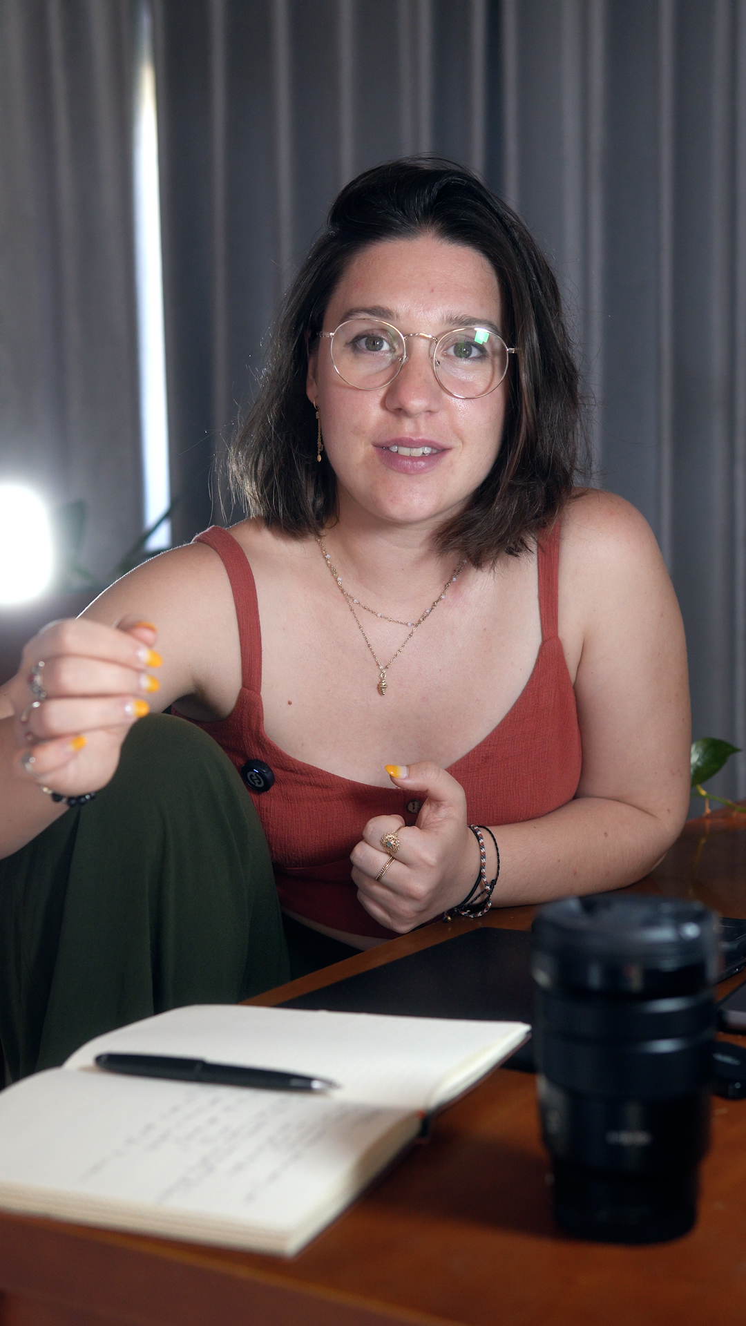
I'm Lou. I've done photography for about 15 years, but only got serious about it in 2017. And honestly, color grading frustrated me so much that I gave up photography for a couple of years. My colors were either boring or a bit weird, and I had no idea why. I was sure I just didn't have the eye for it.
Then, while I was learning motion design, I ended up in a color theory class, and it clicked. What if I applied this to my photos? So I built a method, started using it on everything, and it became the style I have today. It also led me to work as a photo retoucher in studios, where I learned so much more.
In 2025 I decided to share it, and that's how The Color Code was born. Over 800 photographers have taken it since. So if you've ever felt like you just don't have the eye, you do. You just need a method.
More of my work: Instagram · YouTube
What photographers say
A few of the 800+ photographers who've taken The Color Code:
"I've been able to approach my editing with a clear thought process, not just madly moving sliders and hoping for a miracle. I wish I'd purchased it years ago."
Peter W.
★★★★★
"I'm a professional photographer regularly selling my work, and I'm shocked how very little adjustments are making my images come alive and draw attention."
Barb Gonzalez · @barbgphoto
★★★★★
"Give a photographer a preset and you feed him for a day. Teach him how to work with colors and you feed him for a lifetime."
Alain · @aswisswithapulse
★★★★★
"I used to edit solely by intuition. Sometimes it works, more often it doesn't. The color analysis was such an eye-opener for me."
Michèle
★★★★★
"Lou emphasizes nobody is born without a 'color eye.' If your photos feel slightly off, it just means you need the right method. I feel more confident, and now I have a roadmap."
Luis F. De Zubiría
★★★★★
"This was the piece my photo editing was missing. It's more than technical skills. Lou spends real time on the art of color. Refreshing and inspiring."
Jackie Middleton · @jaxblueeyes
★★★★★
"The first results amazed me. I loved the clear, repeatable process, and that it works without presets or other tools."
Kurt · @pfammatterkurt
★★★★★
"I was getting lost in sliders and menu options. The Color Code taught me a systematic workflow to get the colors I want. Really value for money."
Joep
★★★★★
"An excellent explanation of color grading, with an emphasis on deciding the direction and meaning of your processing before you start."
George Simian
★★★★★
"YES! I am much more confident. The whole course was interesting."
Jose Hernandez · @caribbeanshutter
★★★★★
"A great balance of theory and technical how-to. I gained practical tools I can apply directly to my own workflow. Highly recommend."
Kim Morris
★★★★★
"It answered a question I didn't know I had — about why to make color grading choices, and how to bring out my vision."
Robin
★★★★★
Frequently asked questions
Why do my photos look flat?
Usually because the color has no direction. Your light might be fine, but the colors aren't working together, so nothing stands out and the eye has nowhere to land. The fix isn't more saturation. It's choosing a color harmony on purpose, then pushing the colors that carry the feeling and pulling back the ones that don't. That's steps 2 to 4 above.
How do I make my photos pop or look more cinematic?
Cinematic color almost always comes from a clear color harmony (often complementary or split-complementary) plus a little contrast in the right places. It's not a preset or one magic slider. Once you can see the harmony already in your photo and steer it on purpose, that cinematic look stops being an accident and becomes something you can repeat.
How do I stop my edits looking like everyone else's?
By editing from your own intention instead of copying a preset or a trend. When you start every photo by deciding what you want it to feel like, then choose colors to support that, your work slowly becomes recognizably yours. That's how you actually find your style, and how your photos start to feel consistent. It doesn't come from finding the right preset. It comes from having a method you repeat.
Is this a Lightroom or Photoshop course?
Neither, really. It's a color method you apply in whatever software you already use. I show full edits in Lightroom and Camera Raw (which are exactly the same thing), so you never need Photoshop to use it.
Do I need presets?
No. Presets only work sometimes, and usually not on your photo. You'll learn to build your own looks on purpose, so they actually fit the image instead of fighting it.
I'm a beginner, is it too advanced?
Not at all. It takes you from aimlessly guessing to a clear process. Honestly, beginners often get the most out of it, because they skip years of trial and error.
What is the Color Lab?
It's my own color tool, included with the course. It does the hardest step, the analysis, for you and tells you which harmonies fit. It's not a requirement, the method works without it. It's just the tool that makes it even easier.
How long do I have access?
For life, including every update. And there's a 14-day money-back guarantee, so you can go through all of it and decide after.
Stop aimlessly guessing
The full method on real edits, plus the Color Lab, is all inside The Color Code. Learn to color grade any photo, in any software, on purpose.
Get The Color Code · $47
Lifetime access · every update free · 14-day money-back guarantee